5 Image Resizing Mistakes That Hurt Your Website
Resizing images seems like one of the simplest things you can do. Change the width, change the height, and you’re done, right?
Not exactly. Small resizing mistakes can lead to blurry photos, stretched faces, painfully slow page loads, and even lower search rankings. The frustrating part is that most of these mistakes are easy to avoid once you know what to look for.
Here are the 5 most common ones and how to fix them.
1. Stretching the Aspect Ratio
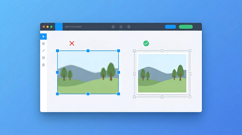
This is the one you see everywhere. Someone resizes an image to fit a specific space, but they change the width without keeping the height in proportion (or the other way around). The result? People look wider or squished, circles turn into ovals, and everything looks “off.”
Why it happens: Dragging image corners freely without locking the proportions.
How to fix it: Always lock the aspect ratio when resizing. Every decent tool has this option. If you change the width, the height should adjust automatically to keep the same proportions.
2. Making Small Images Bigger
Upscaling is one of the most misunderstood concepts in image editing. When you make a small image larger, the software has to guess what the extra pixels should look like. The result is almost always a blurry, soft image.
A 400px wide image stretched to 1200px won’t look good. There’s just not enough pixel data to work with.
Why it happens: Using thumbnails or low-resolution images and trying to make them bigger.
How to fix it: Always start with the highest resolution version you have. If you need a 1200px wide image for your website, make sure your source image is at least that wide. You can always go smaller without problems, but going bigger always costs quality.
3. Over-Compressing Images
Compression is great for reducing file size, but pushing it too far destroys your image. You’ll see blocky areas, rough edges around text, and loss of fine detail. It’s especially noticeable in photos with gradients or subtle color changes.
Why it happens: Setting quality too low (below 60%) to save as much file size as possible.
How to fix it: Aim for 70 to 85 percent quality. This gives you a significant size reduction while keeping the image looking clean. Most people can’t tell the difference between 85% and 100% quality, but below 60% the damage becomes obvious.
4. Uploading Oversized Images
This one might be the most common mistake on the web. Someone takes a photo with their phone (let’s say 4000 x 3000 pixels), uploads it to their website, and displays it at 800 pixels wide. The image looks fine, but the browser downloaded a file that’s 5x bigger than it needs to be.
This kills your page speed.
Why it happens: Uploading photos directly without resizing them first.
How to fix it: Figure out the largest size your image will be displayed at, and resize to that size before uploading. For most blog images, 1200px wide is plenty. For thumbnails, 300 to 400px is enough.
A quick rule: resize to 2x the display size for sharp results on high-resolution screens. If your image is shown at 600px, resize it to 1200px.
5. Sticking With Old Formats
JPEG and PNG have been around forever, and they’re still fine in many cases. But if you’re still using them as your default for everything on the web, you’re leaving performance on the table.
WebP gives you similar quality with significantly smaller files. We’re talking 25 to 35 percent smaller than PNG and 25 to 30 percent smaller than JPEG.
Why it happens: Old habits. Many people just export as JPEG because that’s what they’ve always done.
How to fix it: Switch to WebP for your website images. Almost all modern browsers support it now (over 97%). Keep JPEG or PNG only when you specifically need them.
Recommended Image Sizes for Web
Here’s a quick reference for common use cases:
| Use Case | Recommended Size |
|---|---|
| Blog images | 1200px width |
| Thumbnails | 300 to 400px |
| Full-screen | 1920px width |
💡 Pro Tip
Always check your images on both desktop and phone after uploading. An image might look perfect on your laptop but take forever to load on a mobile connection. Open your site on your phone over regular data (not WiFi) and see how it feels. That’s the experience most of your visitors are having.
FAQs
What’s the best image format for websites?
WebP is the best overall choice for web images right now. It gives you the smallest files with good quality. Use JPEG as a backup where needed.
Does resizing reduce image quality?
Only if you upscale (make images bigger) or compress too aggressively. Resizing an image to a smaller size doesn’t hurt quality.
What width works best for SEO?
Around 1200px wide is a good target for most blog and article images. It’s big enough to look sharp on all screens without being unnecessarily heavy.
Conclusion
Image resizing isn’t complicated, but these small mistakes can add up to real problems for your website. Blurry photos make your site look unprofessional. Oversized files slow everything down. Stretched images just look wrong.
The good news is that all five of these mistakes are easy to fix. Lock your aspect ratio, start with high-resolution images, compress to a reasonable quality, resize before uploading, and use WebP when you can.
🚀 Resize Images the Right Way
Want to resize images without making these mistakes?
👉 Use our Image Editor tool to resize, crop, and optimize your images with proper aspect ratio control.